


The main issues to address were fundamental and common ones, who are our audience and what do we want them to do on this website? Wellx told me they needed the website to drive leads for insurance plans, but they cater to, B2B, B2C and B2B2C markets, selling insurance plans to individuals, partnering with third party insurers and also selling wearable tech on their site, so defining a single user goal is tricky. This was reflected in their original navigation and information architecture which promoted multiple CTAs at the same hierarchy with a secondary emphasis on their own brand.

To address this, I ran cart sorting tests and learnt that users were not familiar with the brand names of Wellx's partners and were mostly unable to assign them to the correct categories. From this I was able to inform the client that a more concise and Wellx-focussed navigation would help users get to know the brand and what they offered. I condensed the multiple CTAs to just one primary goal in the nav bar, and a secondary on the page below, both relating to Wellx's own products and services. The audiences were segmented in the first menu item so that users can easily identify with the content they need, and partners were given their own section.

The client was keen to have a new website that reflected the energetic, modern and luxury ethos of their brand, app and related wearable device.
To address this challenge I introduced a new ‘dark mode’ and fresh complementary palette with smooth, subtle gradients and micro-interactions at key moments.
To improve usability, prevent ‘bounce’ and facilitate error correction for the user, I added the ability to preview and edit the shopping basket, without leaving the product page. Additionally, the check-out flow on the previous version of the website hosted all steps on the same page, creating a high cognitive load for the user. I resolved this by separating the different check-out tasks into three steps/pages, for personal details, shipping and payment.
I adjusted the dark mode theme I’d created for the main website to a lighter alternative during check-out, reflecting the important transactional task being completed by the user at this point, justifying maximised clarity and simplicity with the aim of avoiding error.
Each CTA prepares the user for the next task and the progress bar at the top supports this. There is flexibility to go back and change details and price breakdown is clear.
Click through the images below to follow the new E-commerce flow from product page, to basket, to payment.


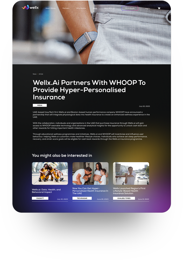
The final website included updated navigation, company information pages, ecommerce, contact forms and a newsroom. To reflect the energy of the brand, I added movement where possible with video content, animated gradients and microinteractions on various elements.


Overall, both myself and the client team are very happy with the result and feel that great improvements have been made to the navigation in particular, as well as a more cohesive aesthetic across the site.
The nav bar itself was the most challenging element and through card sorting and usability testing we found that the wording of the menu bar items was unclear and needed to be more accessible to users who are not overly familiar with either the Wellx brand or insurance-specific terms.
With more time I would have liked to focussed on initial research and conducted surveys and interviews to better understand the unique needs of the B2B versus B2C users.


